Confirel: UTU + Svakom
How I helped a local Cambodian brand visualise their tea packaging using graphic and product design. 🫖

Client
Confirel
Beverages
Sector
Graphic and product design
My Role
October 2023 - January 2024
Duration
Project Brief – UTU & Svakom Tea Branch Packaging
Objective
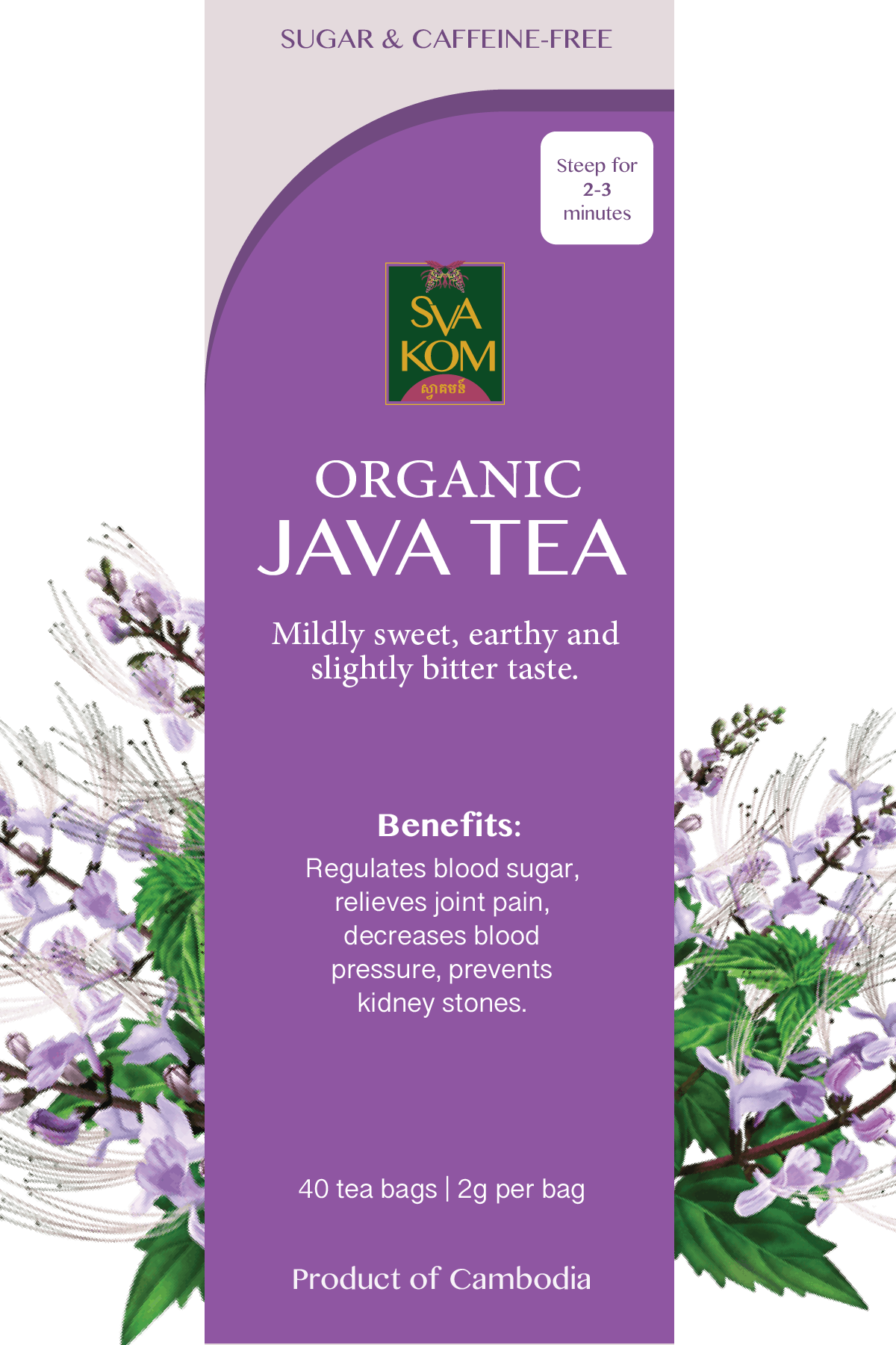
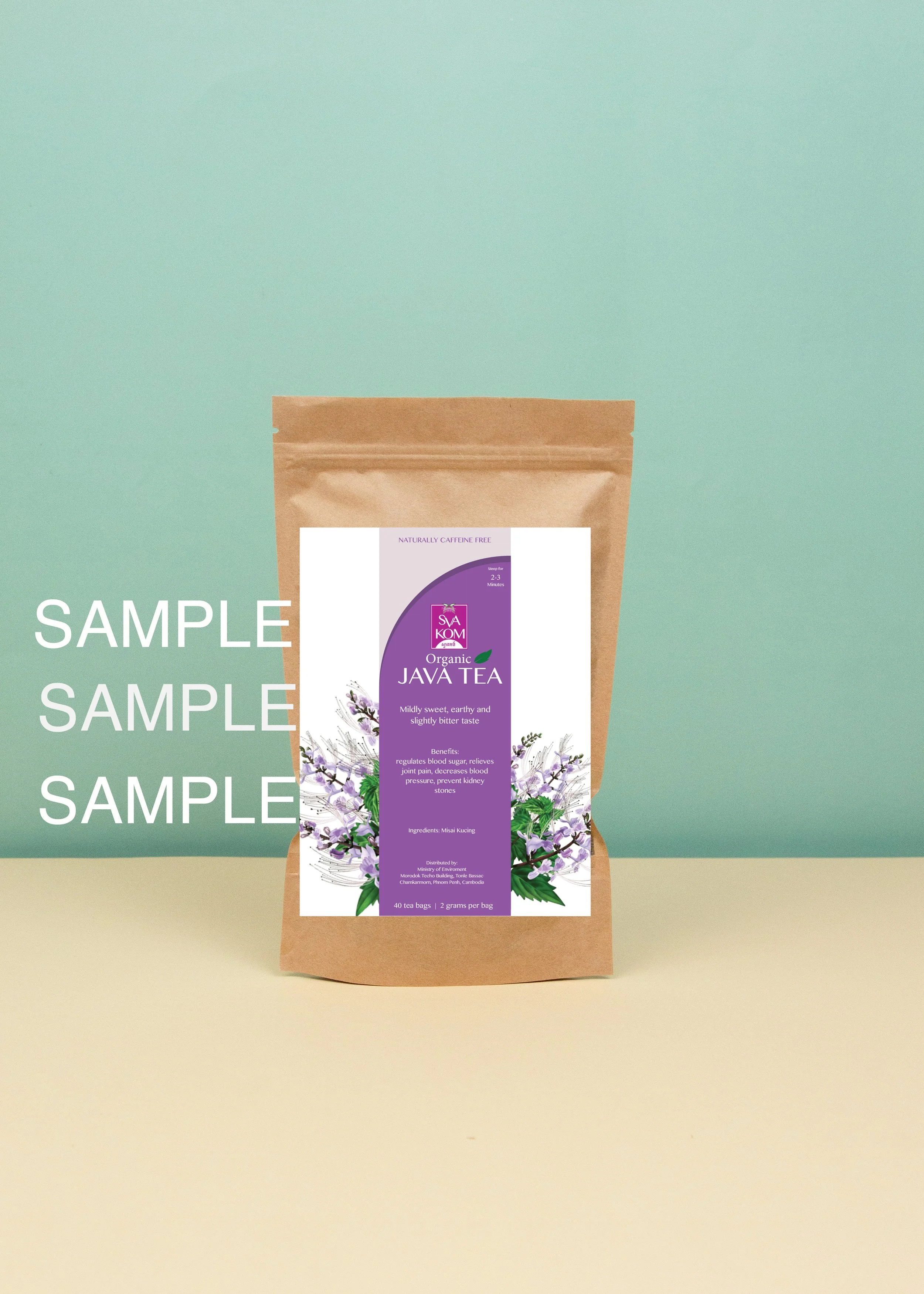
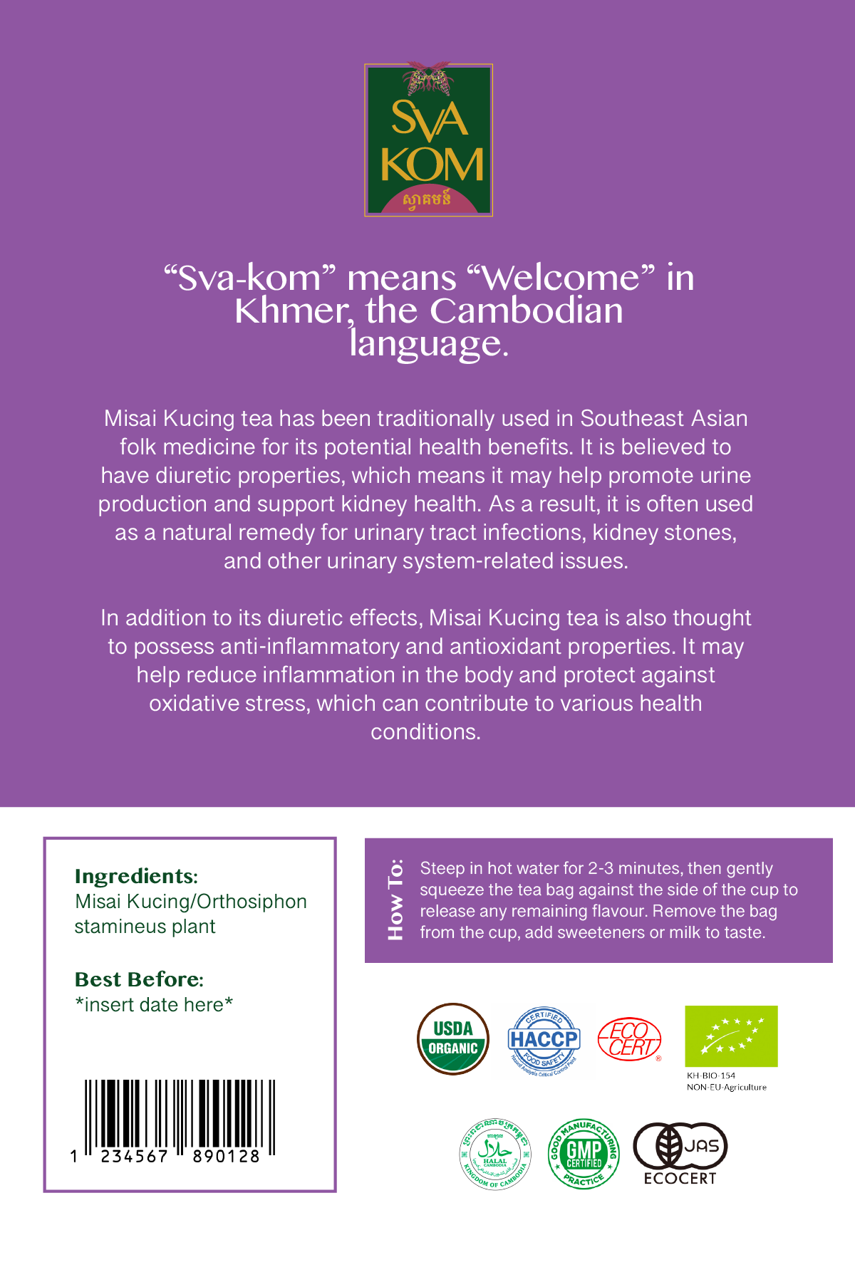
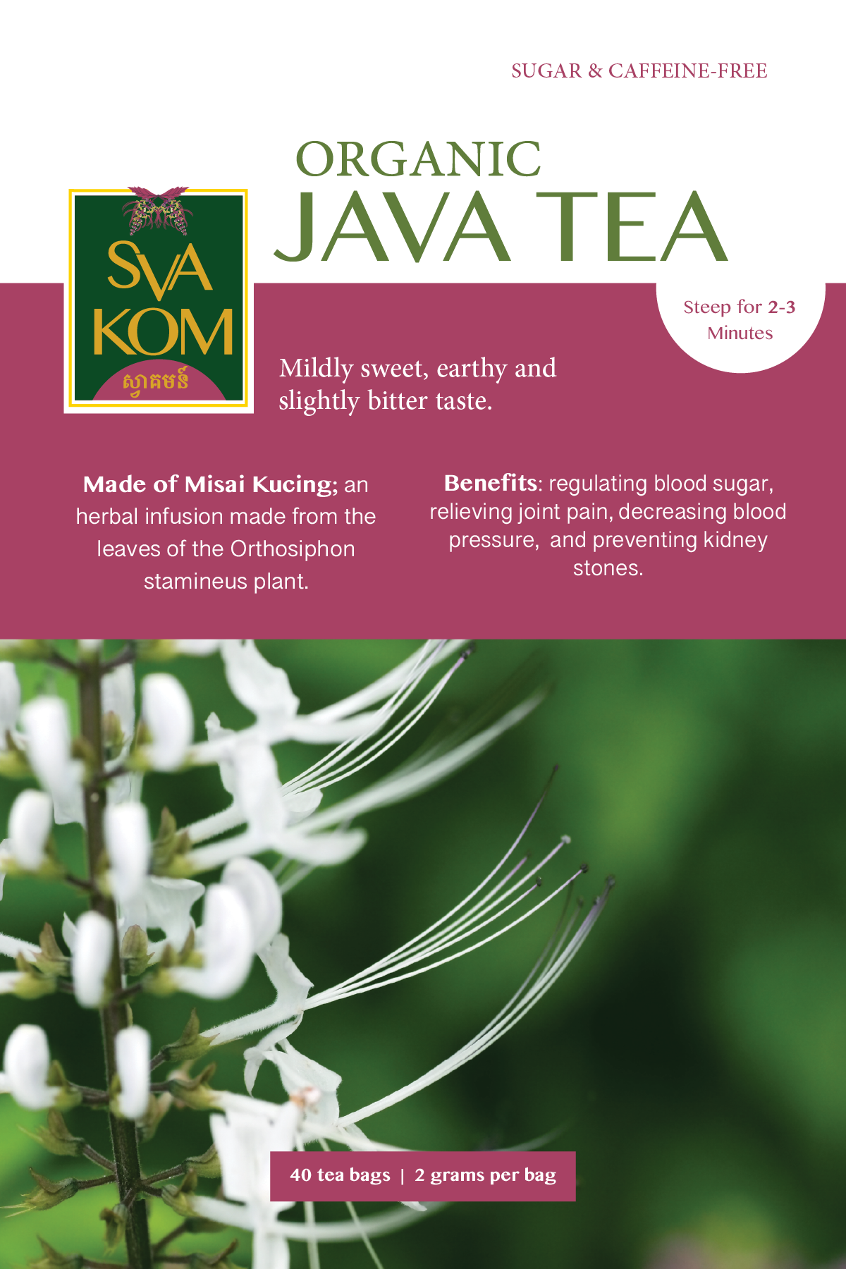
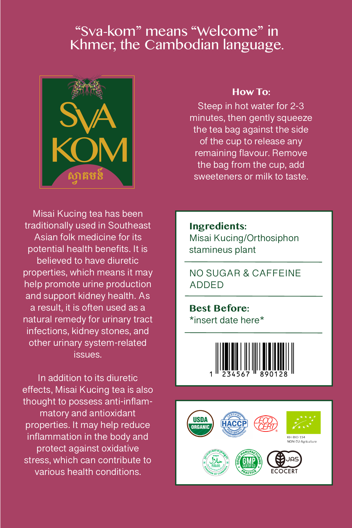
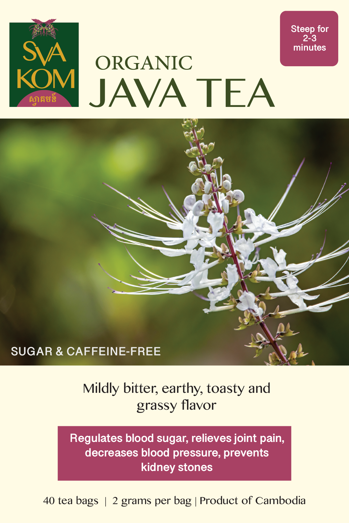
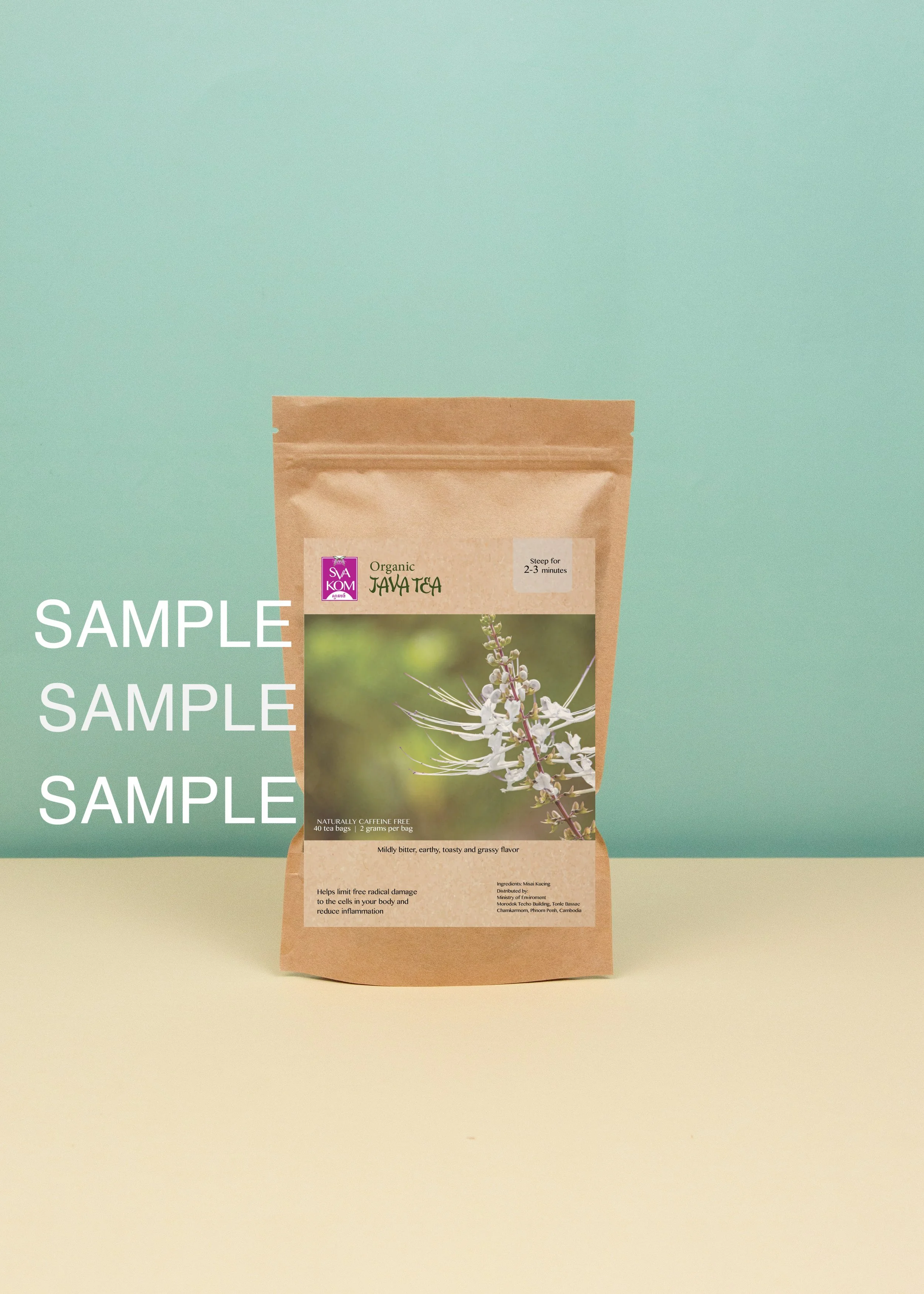
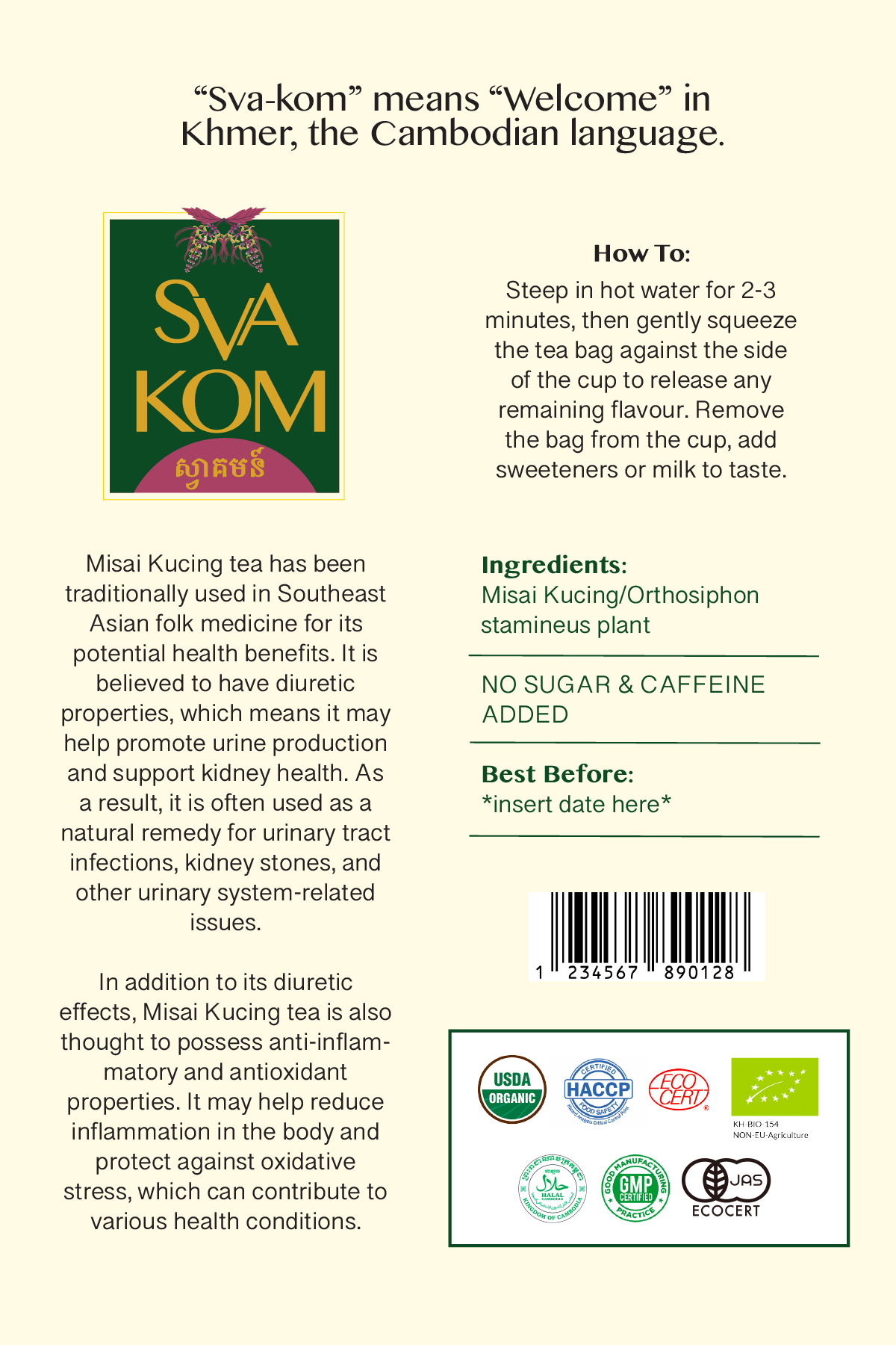
Using Adobe Illustrator, I developed unique packaging identities for two new tea product lines — UTU and Svakom — that align with Confirel’s brand heritage while capturing the attention of modern, design-savvy consumers. I also created new logos for both of these product lines.
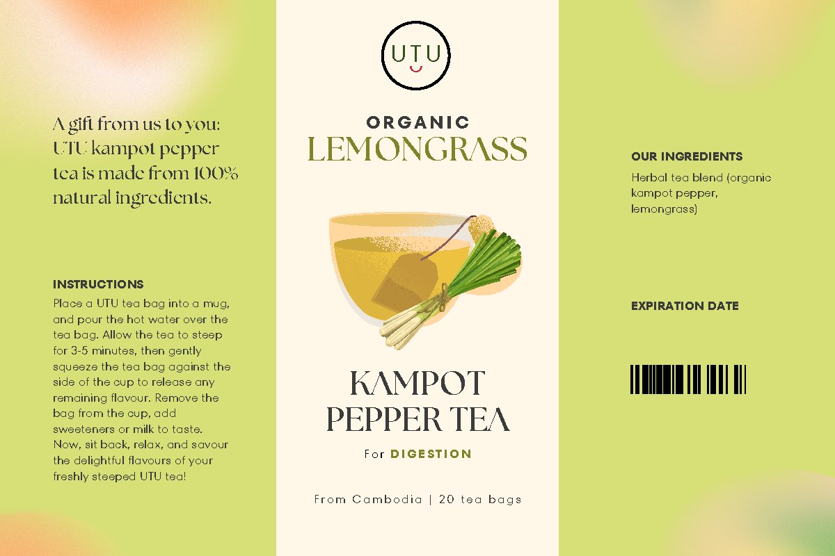
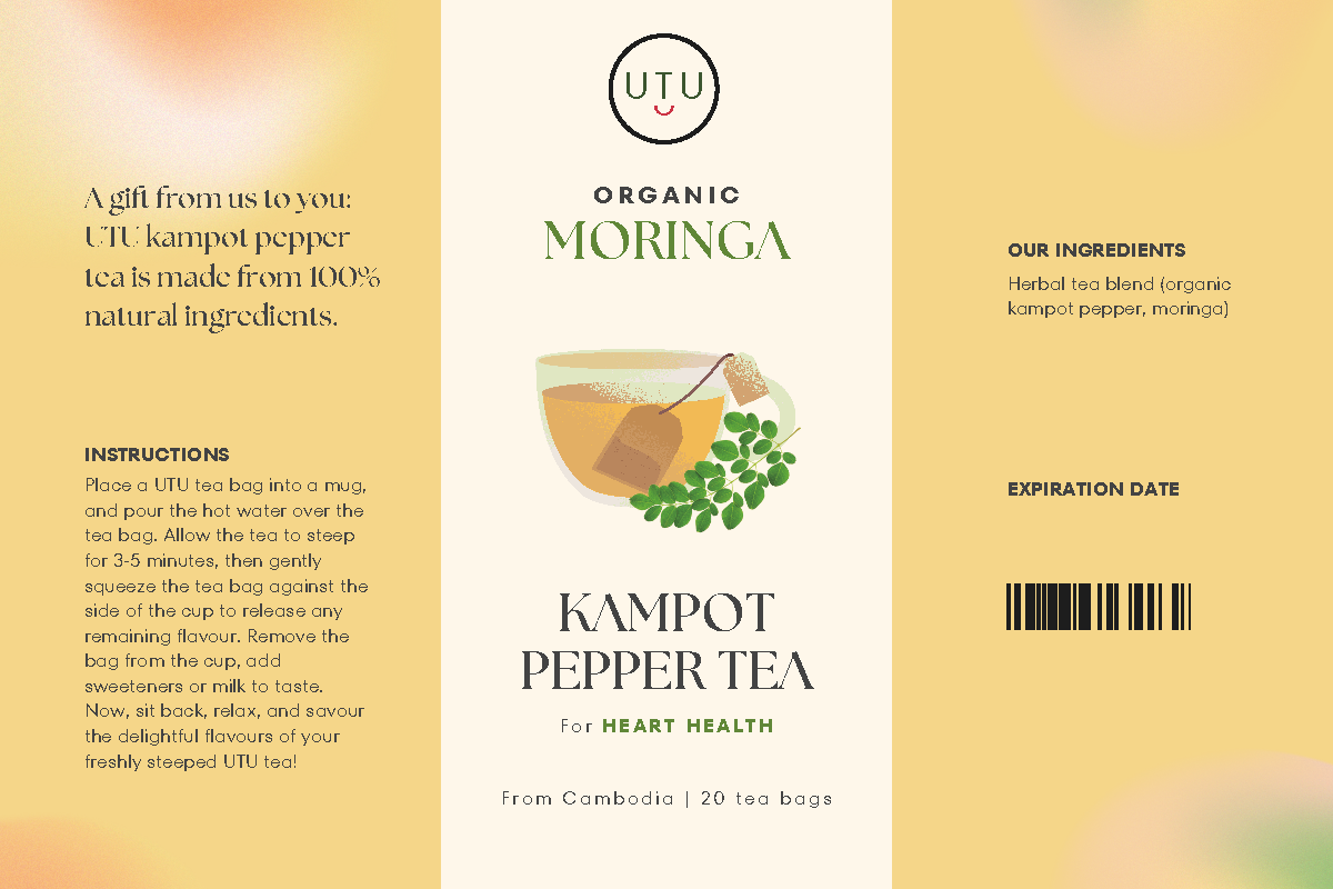
For UTU, I envisioned a soothing and organic aesthetic that captures the essence of wellness. I chose natural green and soft neutral tones, complemented by hand-drawn botanical illustrations inspired by Khmer art and the tea’s origin. The label’s typography was selected for its gentle curves and readability, enhancing the product’s calming appeal.
By contrast, Svakom calls to mind energy and bold flavor. Here, I leaned into deeper, vibrant accents, and dynamic patterns evocative of swirling tea leaves. Strong typography and confident layout play up Svakom’s bold identity.
Both brands were developed in 2D mock-ups—to define their visual identity and layout—and then brought to life in 3D prototypes, showcasing how the designs would look as actual tea bags. These renders enabled me to assess how the packaging communicates on the shelf and in lifestyle contexts.


Mock-ups