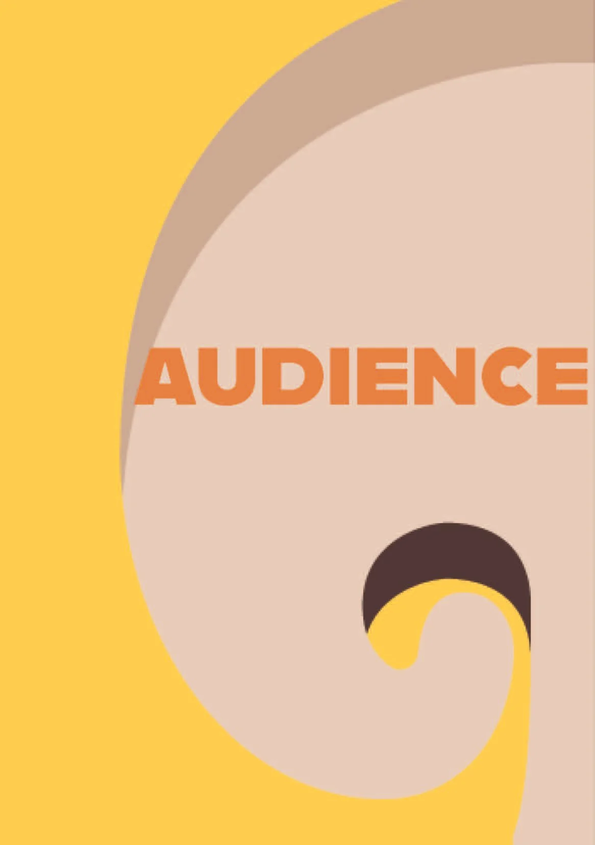
Food Behind Bars
How my team and I tackled the rebrand for a London-based charity focused on improving prison food. 👩🍳
Studio La Plage (Food Behind Bars)
Client
Hospitality
Sector
My Role
Responsible for prototyping, wireframing, and creating mock-ups to translate research insights into visual concepts and testable designs
Duration
October 2021 - January 2022
What is Food Behind Bars?
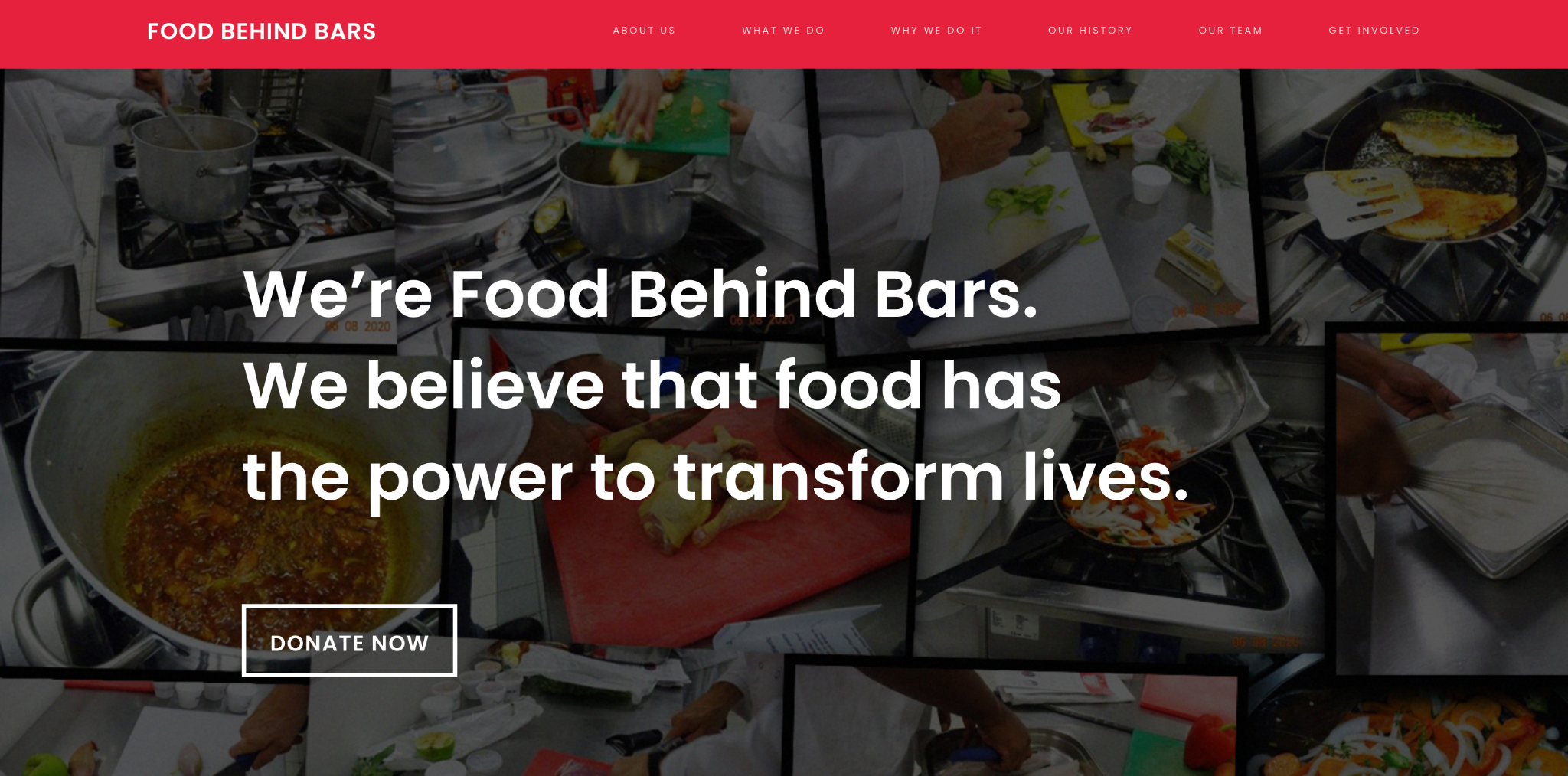
Food Behind Bars (FBB) is a UK-based social enterprise focused on improving the quality of food in prisons. They collaborate with prisons, caterers, and policymakers to provide healthier and more nutritious meals, while also raising awareness of the impact food has on physical and mental well-being. Their work aims to create lasting change within the prison system by promoting dignity, health, and rehabilitation through better food.
For my Professional Practices unit for the BA (Hons) Design Management and Cultures program at UAL, we were given a brief by Studio La Plage — a design studio based in East London — with developing a new visual identity for FBB. We were tasked with establishing the charity as a leader in its field, moving away from traditional corporate visuals to create an engaging and emotive brand that reflects its pioneering mission.
The Brief
“Create a new visual identity that positions the Food Behind Bars (FBB) brand as a leading charity within its field. Breaking the boundaries of the expected corporate visuals that are common within the sector to create an engaging, emotive brand, that reflects the pioneering nature of FBB.”
This brief was so exciting to work on, as it was one of my first opportunities to collaborate with a professional, local client whose feedback could directly inform their future branding. It was rewarding to contribute to such a forward-thinking organisation that places people at the centre of its mission. I also valued the chance to work alongside students from other disciplines (in London College of Communication) across design, media, and screen, which brought fresh perspectives to the project.
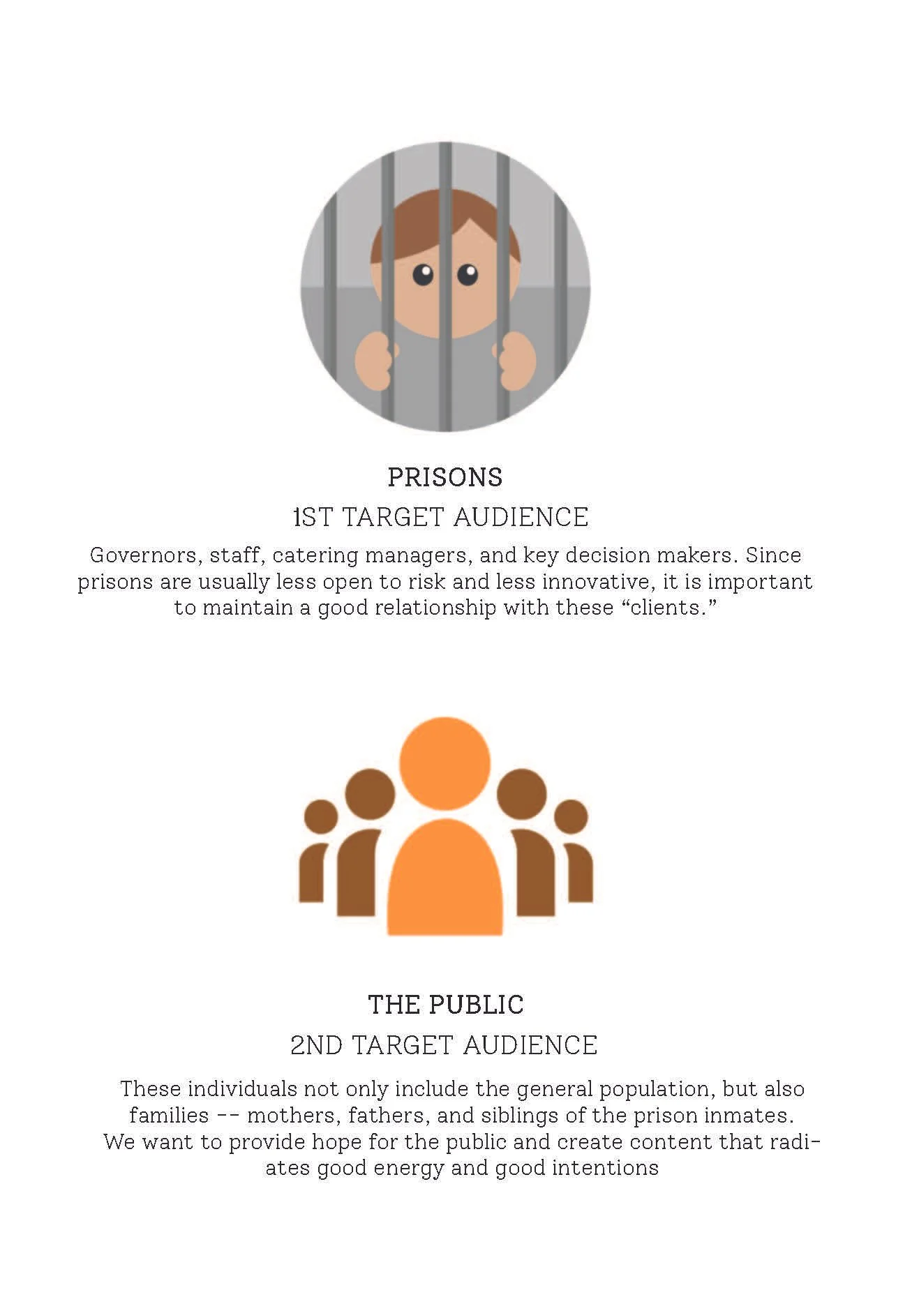
Our team of five chose to redesign the Instagram branding for FBB by developing a cohesive style lexicon — inspired by warmth and comfort — that would shape a proactive and forward-thinking social media feed focused on issues surrounding food in prisons. With both prisons and the public as our key audience personas, we aimed to create content that could drive positive change within the prison system. While we were eager to get started, we understood the importance of conducting thorough research to inform our design decisions.
Research
While we initially approached the project with ambitious ideas, the research phase grounded our proposals and helped us refine our direction. We began by examining FBB’s existing brand presence and developed a moodboard to better understand its current visual identity. Although our team set out to rebrand the organisation’s Instagram, it quickly became clear that the task extended far beyond a new profile picture or updated posts.
➡️ I used tools such as Google Docs for note taking, Miro for visual-planning and mind mapping, Figma and Procreate for prototyping and the mock-up wireframes.


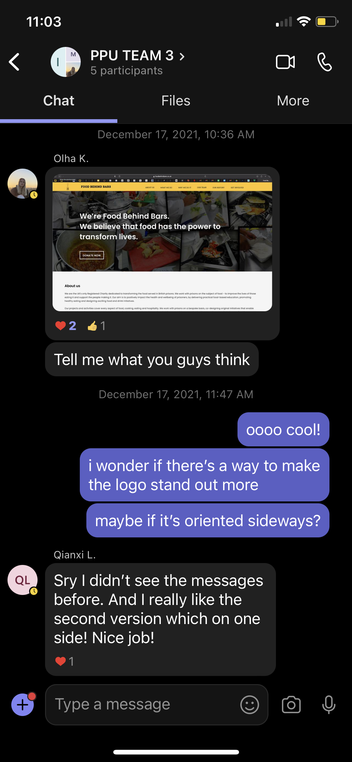
We primarily communicated through Microsoft Teams, holding one or two meetings each week depending on the workload. These meetings ranged from quick 15-minute check-ins to in-depth sessions lasting over two hours. Tasks were distributed as evenly as possible, with each member taking on responsibilities aligned with their strengths — whether in research and data collection, illustration, prototyping, or other areas. While working on our individual tasks, we regularly checked in via Teams to offer feedback, share progress, and clarify any questions that came up.

These insights informed our design approach, ensuring that the rebrand communicated not only visually but also meaningfully, aligning with Food Behind Bars’ mission of change and rehabilitation.Our research revealed the significant role nutrition plays within prisons, highlighting how poor diets negatively affect both physical and mental health, while also contributing to cycles of reoffending.
Strategy-wise, I was responsible for researching the attributes of FBB’s current marketing strategies.
Design Process
I was primarily responsible for the digital and visual elements of our project, creating mock-ups using Photoshop and Procreate. My role focused on designing Instagram posts and illustrating stylistic elements for infographic content. I challenged myself to make each post original and engaging, adding character to the feed while ensuring consistency across the visuals.
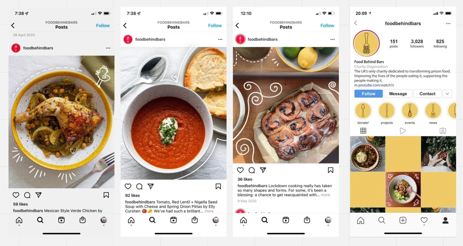
👉 Designing the infographics required careful attention to both composition and content on every slide. To maintain variety and avoid repetition, I frequently sought input from my teammates on ideas I could incorporate into the illustrations. Our designs were guided by a defined style, colour palette, and typography, which provided structure but also pushed me to find creative ways of making each post stand out.
For our project, emotional intelligence played a central role in shaping the design process, particularly in its marketing aspects.
Through research, we gained a deeper understanding of the issue and developed audience personas. This process built empathy, allowing us to recognise the humanity of prisoners and the impact of food on their well-being. Applying that empathy to our work became a driving force behind our rebranded Instagram page, aligning our values and giving us a clear direction.
By listening to the client’s needs and considering the key stakeholders, we were able to establish a design that was both meaningful and engaging.
Key Outputs & Proposal
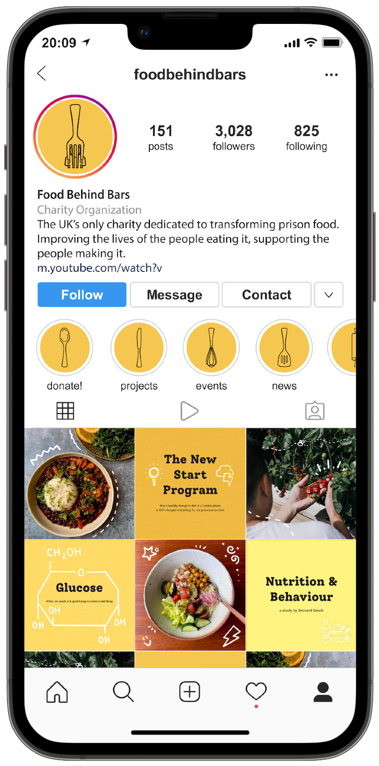
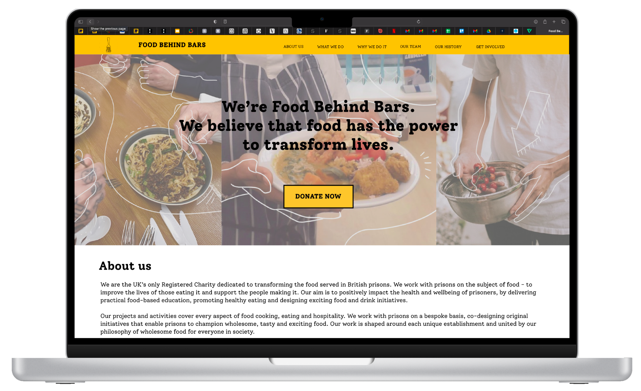
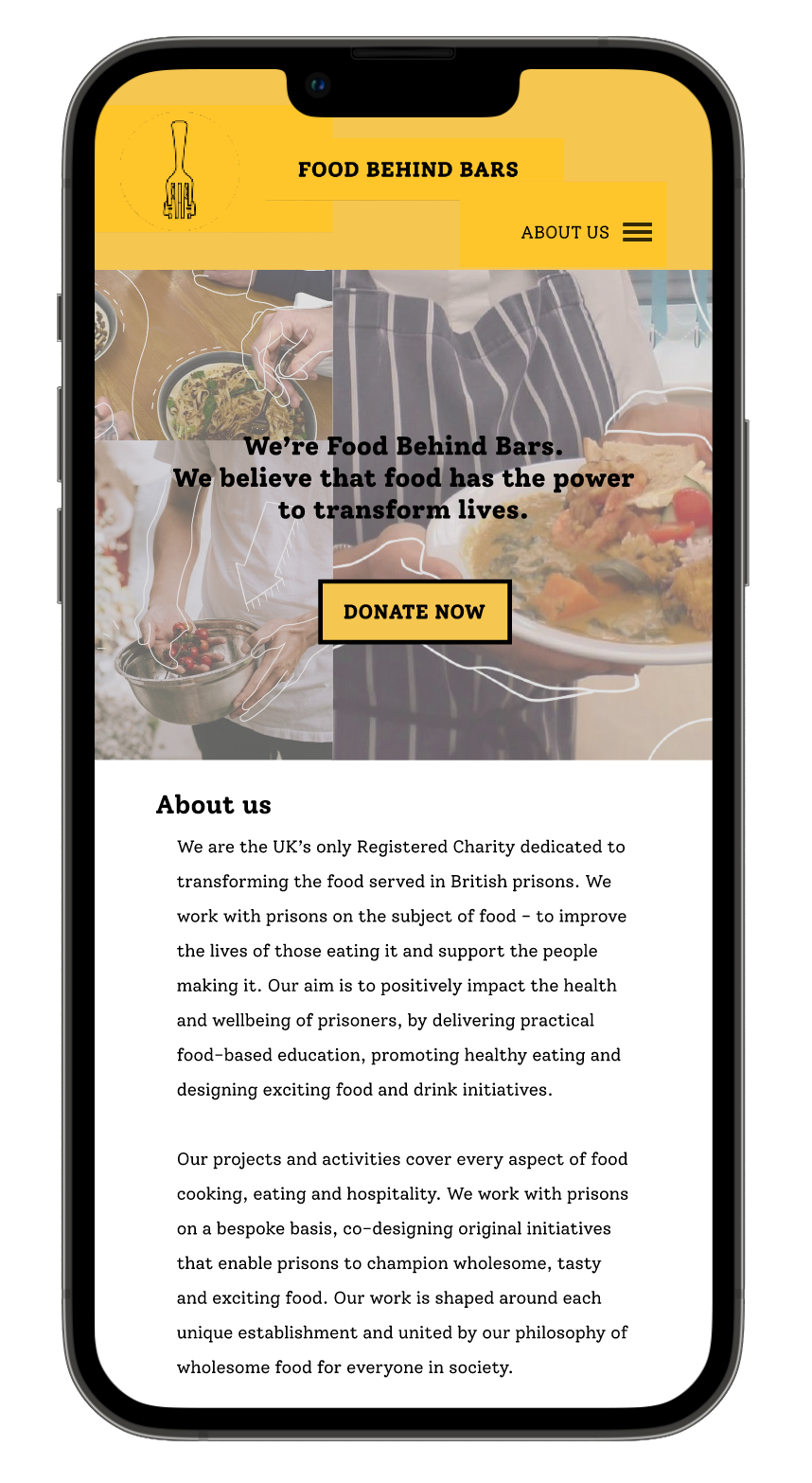
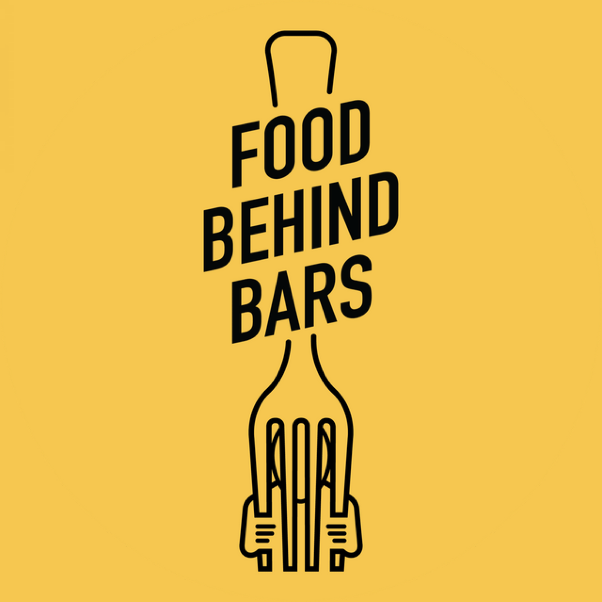
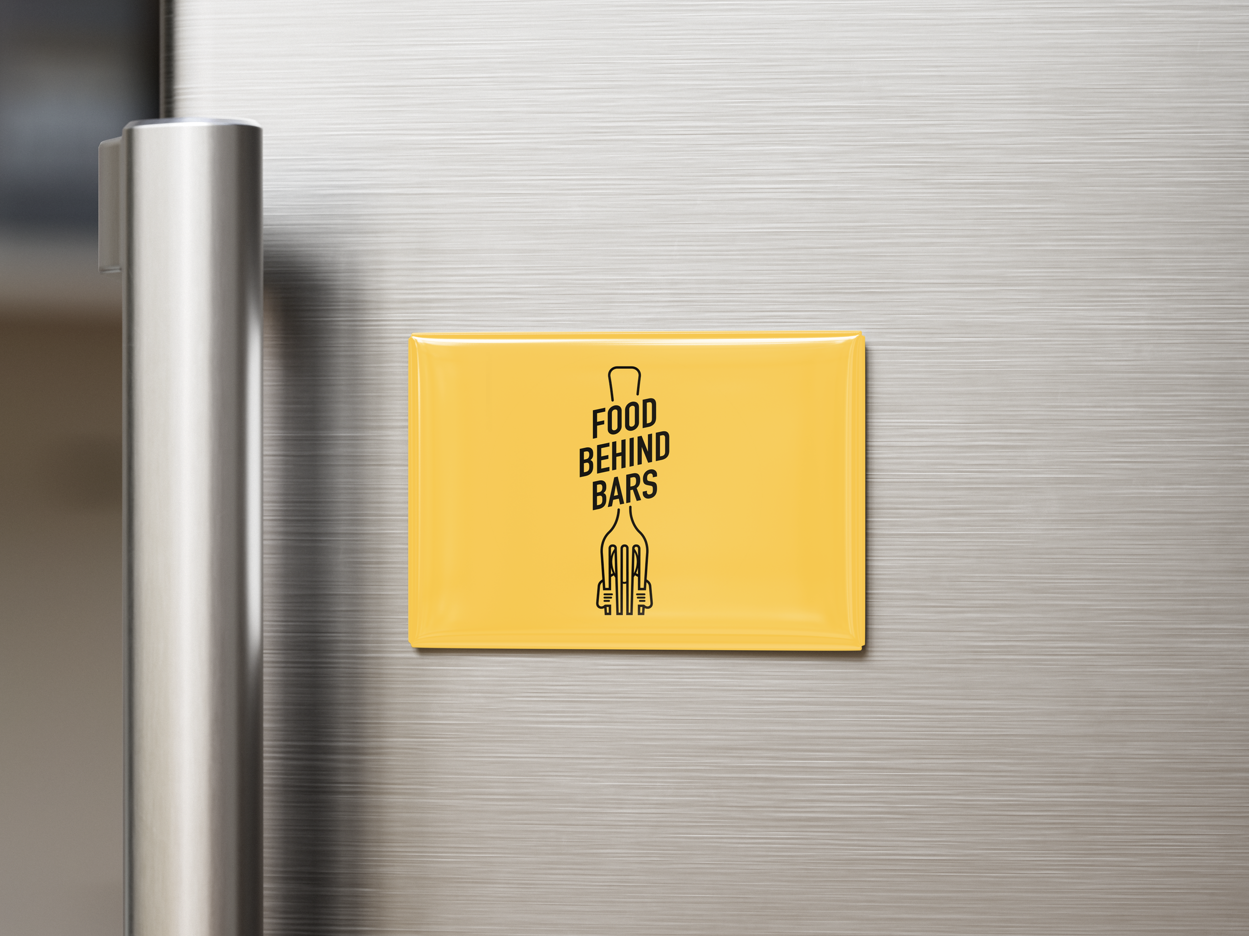
In the end, we delivered strong project proposals and a final presentation for our PPU project, gaining valuable insight into the role of professional practice in shaping us as designers and leaders. Our outcomes included a new logo, social media highlights and post mock-ups (per the client’s request), and a brand book outlining the refreshed Food Behind Bars Instagram identity.
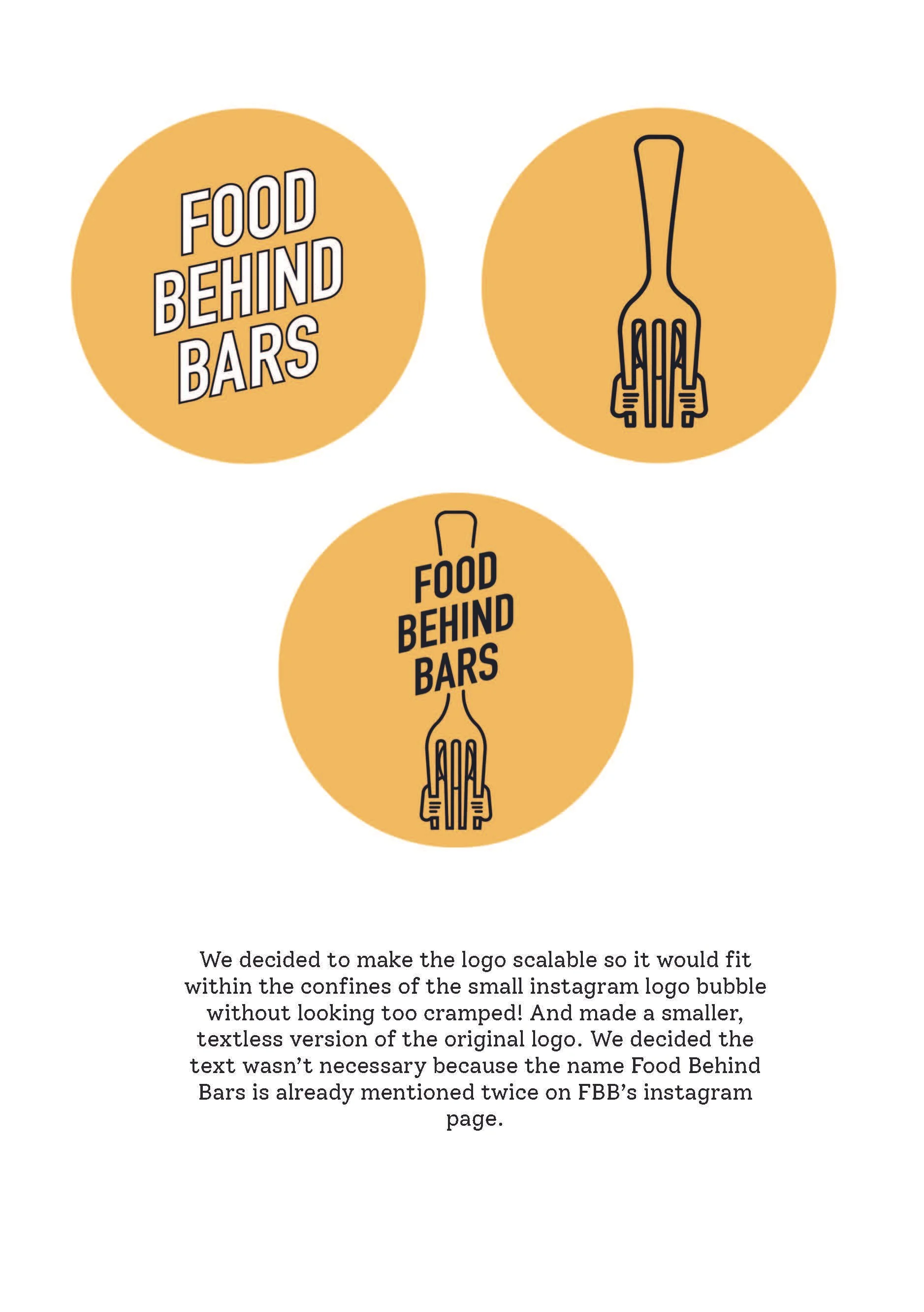
To refine the logo, we tested our designs through an online logo design forum, where participants compared our concepts with the original and provided feedback by selecting their preferred option. We also made overall changes to our design after completing an virtual critique with the Art Director of Studio La Plage.

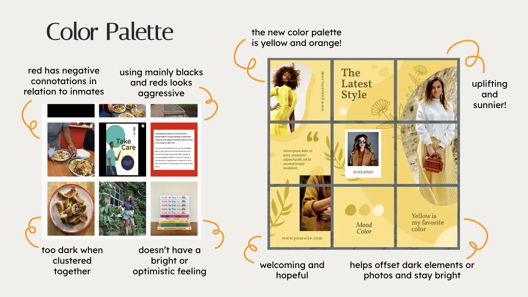


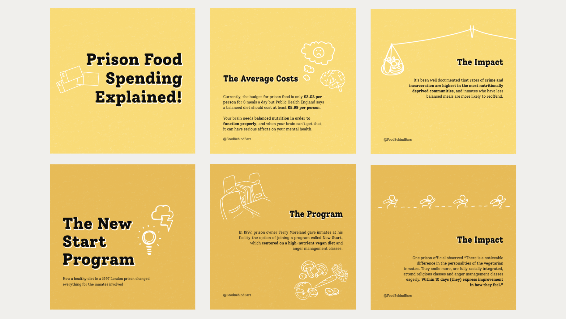
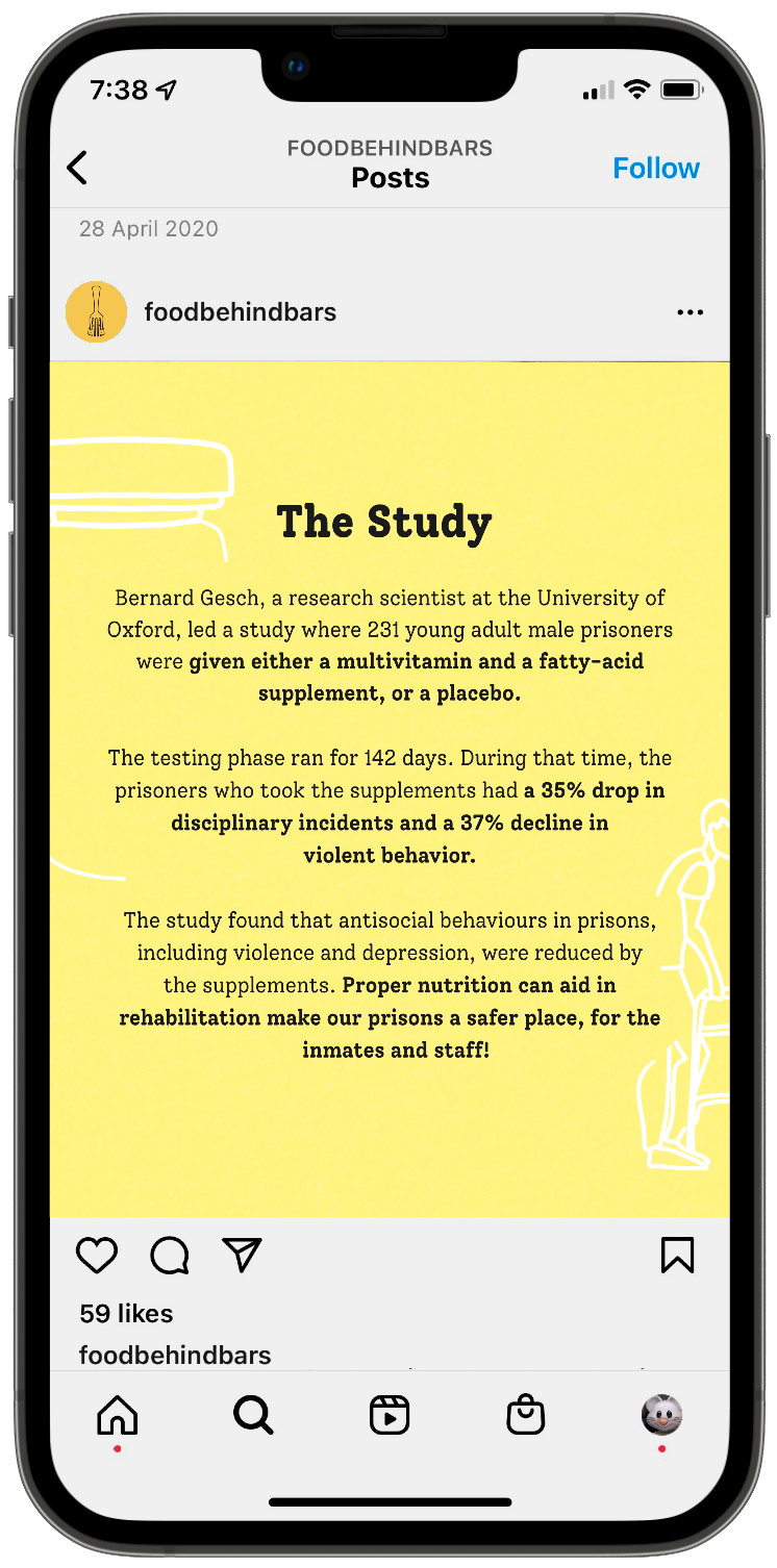
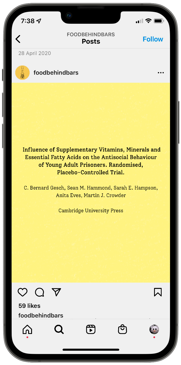
The illustrations add a playful and distinctive touch to the food photography, keeping the visuals fresh and engaging. White accents help balance darker images, ensuring the overall feed remains bright and aligned with the upbeat tone we aimed to convey.
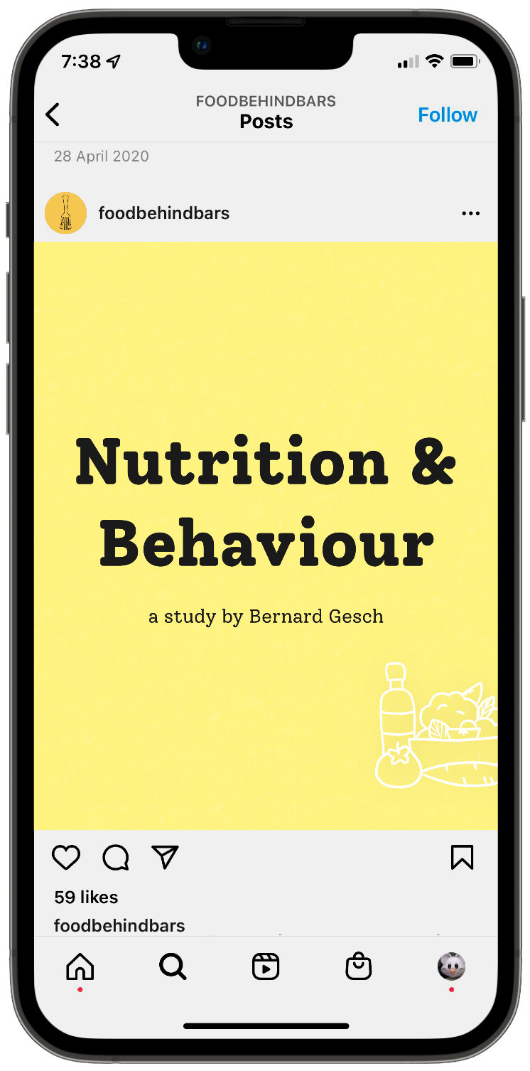
Alongside these visuals, we created informative threads to educate audiences about the importance of proper nutrition in prisons. While the illustrations appear simple, careful consideration went into selecting the right elements and arranging their composition for each slide.